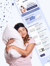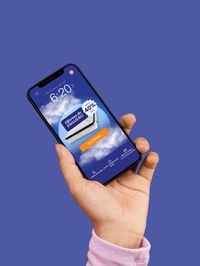
Estelar
ux/ui designEstelar is a brand that sells mattresses and pillows. Dedicated to enhancing the sleep experience of its customers, it has undergone a website redesign to offer a more seamless and enjoyable shopping experience.

Challenge
I was hired to completely redesign the E-Commerce site. The objectives included updating and improving the existing branding and look and feel, enhancing the purchasing experience for customers, and creating a mattress comparison feature to help customers make choices easier and increase conversions.
Product Goals
- Decrease U-turns and rage clicks.
- Increase conversion rates by 35% by assisting customers in choosing their product.
- Provide an easy-to-understand & user friendly purchase experience.
- Update the branding and aesthetics to elevate brand's image.
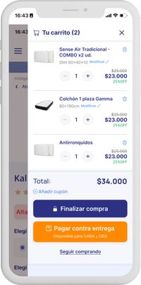
- Add a "payment on delivery" feature to further increase purchases by 5%.
UX research
Product Review:
Reviewed the whole site, the analytics, the information architecture, heat maps and UX writing, paying close attention to userflows in both mobile and desktop sizes.
Benchmarking:
Evaluated the branding, user flows, product categorization, product page, UI design, etc. of indirect and direct competitors
User Research:
Created user personas and conducted interviews, focusing on user needs and pain points.
Customer Insights:
I monitored social media and held a meeting with Estelar's Customer Service team to identify common user frustrations and questions.
Product Mapping:
Identified top products and user pathways, recategorizing all the products on the site for better organization and user experience.
Before the re-design
Before the redesign, the branding looked outdated and failed to resonate with modern consumers. The website suffered from significant issues related to product categorization and user interface, making it difficult for clients to navigate and compare different mattress options. This confusion led to a poor user experience, causing potential customers to abandon their shopping journey, ultimately resulting in missed selling opportunities.
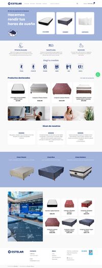


Branding
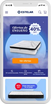
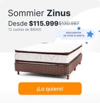
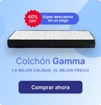
For this project, I revitalized the branding by updating the color palette to convey the essence of sleep and relaxation, effectively enhancing the perceived quality of the products. Additionally, I refined the typography, choosing fonts that improve readability and reflect the brand's serene personality.










Some distinctive features of this project
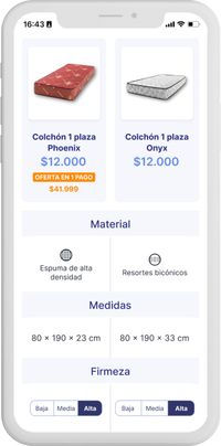
A big takeaway from the user interviews conducted was that customers want to be able to compare different products to choose the one they like the most. That is why I created a comparison table which helps make a side-by-side comparison with ease.
Product comparison
Customers can now easily compare the main features of mattresses and pillows side-by-side. This new functionality allows users to make informed decisions by providing clear and concise comparisons of product specifications, benefits, and pricing, among others.
Find your mattress test
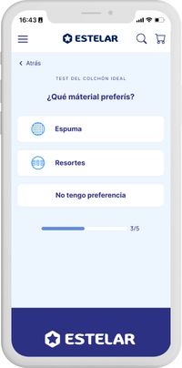
Choosing the right mattress can be overwhelming. Too many options, sizes, materials and structures... I designed the ¨find your mattress test¨ which helps customers find 3 mattress options in 1 minute.
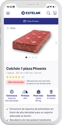
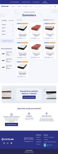
Product page & catalog


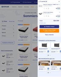
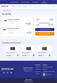
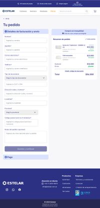
Checkout
Let’s work together
Tell me more about your project.
Email:
victorianazcontact@gmail.com


