Psi Link
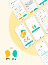
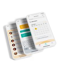
App / branding / ux/ui designPsi Link is a revolutionary app that seamlessly connects patients with therapists, streamlining the entire process from booking and attending sessions to making payments.

Challenge
Finding a good therapist is challenging. Patients often visit multiple therapists before finding a suitable match, wasting time and energy. Therapists also spend a significant portion of their work hours on administrative tasks like scheduling and payments, which adds unnecessary stress and consumes valuable time.
Solution
Psi Link simplifies the therapeutic process by connecting patients with compatible therapists. The app offers personalized recommendations, professional catalogs with search filters and user reviews. It also provides tools for therapists to manage schedules and payments, reducing administrative burdens and enhancing the efficiency of mental health care.
UX research
User Research:
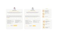
Conducted comprehensive user research to understand the needs, behaviors, and pain points of the target audience. Created detailed user personas and conducted in-depth interviews.
Benchmarking:
Evaluated direct and indirect competitors: their user flows, UI design, product categorization, and overall user experience to identify strengths, weaknesses, and opportunities for differentiation.
Information Architecture:
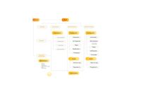
Reviewed and optimized the app’s information architecture, ensuring intuitive navigation and improving overall user experience for quick and efficient content discovery.
Cardsorting:
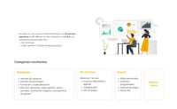
Refined and validate the organization of information within the app. Ensured that the content structure matches user expectations and enhances the overall usability of the product.
User Flows:
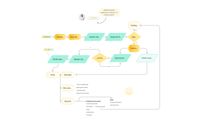
Designed and analyzed user flows to map out the steps users take to accomplish specific tasks within the app. Identified potential bottlenecks and areas for improvement, ensuring a seamless and efficient user experience from start to finish.
Branding
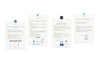
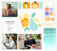
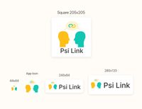
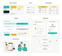
For this branding, I selected orange and aqua green as the primary colors. Orange symbolizes happiness and warmth, while aqua green is associated with psychology and tranquility. The goal was to create a brand that feels inviting and approachable, ensuring that it resonates with users on an emotional level. The combination of these colors reflects a balance between positivity and professional care, making the brand both welcoming and trustworthy.
Moodboard
Logos
Design System
Solution
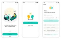
Welcome New Users
Psi Link offers an intuitive onboarding process and flexible account creation options tailored to user preferences.

Get Personalized Recommendations
By completing the questionnaire, users receive tailored therapist recommendations that best suit their needs.
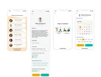
Choose a Psychologist and Book a Session
Users can access detailed therapist profiles, including work modalities, qualifications, and user reviews. They can send messages to therapists or book sessions directly.
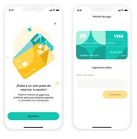
Choose a Payment Method
The final step before confirming an appointment is selecting the preferred payment method.
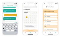
Home
The Home section includes the calendar, upcoming sessions, video call links, and all necessary features to modify or reschedule appointments.
Heuristics evaluation
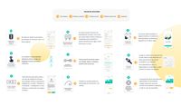
I evaluated the design using heuristics to ensure alignment with the latest trends and Jakob Nielsen's usability principles. This approach helped identify and address usability issues, enhancing the overall user experience.
Usability Testing
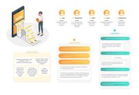
The design underwent usability testing, leading to iterative improvements based on the feedback received. Participants completed a satisfaction questionnaire, revealing a 95% satisfaction rate with the app's usability and functionalities. This process ensured a highly user-friendly and effective final product.
Let’s work together
Tell me more about your project.
Email:
victorianazcontact@gmail.com


